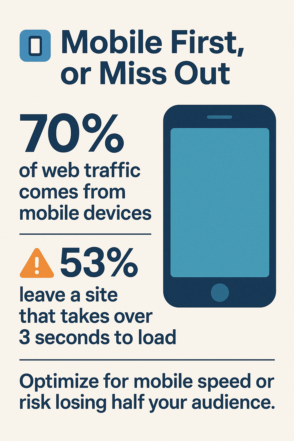
In today’s fast-paced digital world, ensuring your website’s mobile design is up to date with the latest trends is crucial. With 70% of web traffic now coming from mobile devices, neglecting mobile optimization can be a costly oversight. Shockingly, 53% of users will leave a site if it takes longer than 3 seconds to load, highlighting the dire need for speed and efficiency (ThinkwithGoogle). The mobile-first revolution isn’t just a buzzword—it’s a necessity. Your mobile site acts like a 24/7 salesperson, requiring more than just a sleek appearance; it needs intuitive design and fast access to essential features. As we look ahead to 2025, understanding the top trends in mobile website design, such as Progressive Web Apps, voice-optimized interfaces, and AI-powered personalization, will be pivotal for staying competitive and retaining visitors—your business’s virtual calling card must be ready for this evolutionary step.
The Significance of Mobile Web Design
In today’s digital age, understanding the significance of mobile website design is essential for businesses. As more consumers shift their browsing habits to mobile devices, companies must adapt to meet these changing dynamics. Here’s why mobile website design matters now more than ever.
Understanding Mobile Traffic Dominance
Mobile traffic is the reigning champion in the realm of web usage, accounting for a staggering 70% of all online interactions. This dominance signifies that your customers are more likely to find you on their phones than on a desktop. Ignoring mobile traffic means missing out on a vast pool of potential clients. Adaptability is key – websites should be designed with mobile traffic in mind to capitalize on this trend.
Make sure you avoid these 7 Warning Signs of Bad Websites That Kill Sales.
Impact of Loading Times on User Retention
Let’s face it, nobody likes waiting. 53% of users will abandon a mobile site if it takes longer than 3 seconds to load. This is a crucial consideration as loading times directly impact user retention and satisfaction. Faster loading not only improves user experience but also enhances your site’s SEO ranking.
The Mobile-First Approach
The mobile-first approach is the modern design strategy that prioritizes mobile users before desktop. This ensures that your website is always optimized for the majority of its visitors. By putting mobile users at the forefront, businesses can create a seamless and engaging experience.
Importance of Instant Loading Speeds
Instant loading speeds are imperative in a mobile-first world. A site that loads quickly ensures visitors remain engaged and can access the information they’re seeking without delay. This not only helps in retaining users but also signals to search engines that your site offers a quality experience.
Designing for Thumb-Friendly Navigation
Thumb-friendly navigation is crucial on mobile devices. Users should be able to easily interact with your site using just one hand. Placing important elements within thumb’s reach enhances usability and encourages longer browsing sessions. This means more potential for conversions.
Crafting Clear Calls-to-Action
Crafting clear calls-to-action (CTAs) is vital in guiding users through your mobile web design. CTAs should be prominent, concise, and easy to find, ensuring that users know exactly what action to take next. This can significantly boost conversion rates and drive business outcomes.
Ensuring a Distraction-Free Checkout
A distraction-free checkout is the final step in securing a sale. Users should experience a smooth, intuitive checkout process without unnecessary interruptions. Simplifying the checkout process reduces cart abandonment rates and enhances user satisfaction, ultimately leading to increased sales.
Progressive Web Apps (PWAs)
Progressive Web Apps (PWAs) are revolutionizing mobile web design, bringing a new level of functionality and user experience that traditional websites simply can’t match. They combine the best of web and mobile apps, offering a seamless and engaging user experience. Here’s how PWAs are advancing mobile technology, especially for businesses targeting mobile users.
Advantages of PWAs for Mobile Devices
PWAs load faster than standard websites. This instantaneous loading time means users are less likely to abandon the site out of frustration, which is crucial considering the 53% of users who abandon sites taking longer than 3 seconds to load. They are designed to function offline or on low-quality networks, ensuring users have access to content no matter where they are, reminiscent of how a native app operates.
PWAs provide a native-like experience. By fully embracing the capabilities of a device, such as sending push notifications and being installable on a user’s home screen, they provide an app-like interface and functionality without the necessity for app store downloads. This fusion of web and app features allows users to interact with a PWA as smoothly as they do with a mobile app.
Increased engagement and user retention are also significant benefits. PWAs enhance user interactions with features like full-screen experience, and by leveraging the power of browser caching, they improve performance, ensuring that businesses maintain their audience’s attention. With a PWA, businesses can send timely and pertinent updates via push notifications, enhancing customer engagement and promoting user interaction.
Learn Everything You Need To Know About Technical SEO with my in-depth guide.
Case Studies: Las Vegas Businesses Implementing PWAs
Las Vegas businesses are at the forefront of adopting PWAs, leveraging their advantages to ensure a robust online presence. For example, the Bellagio Hotel in Las Vegas has integrated a PWA to deliver real-time updates about events and performances. This has significantly enhanced the customer experience by providing access to up-to-the-minute information about shows and amenities, keeping guests informed and engaged.
Similarly, the Las Vegas Convention and Visitors Authority has implemented a PWA to serve both tourists and local visitors. By offering a quick-loading, offline-accessible guide to the city’s attractions, this PWA ensures that users have seamless access to information on-the-go, regardless of their connectivity.
Zappos, a renowned online shoe and clothing retailer headquartered in Las Vegas, utilizes a PWA to provide an immersive and swift shopping experience. By offering offline access to their product catalog and utilizing push notifications to alert users to new deals and promotions, they have managed to boost user engagement and sales conversions.
These case studies from Las Vegas demonstrate the transformative power of PWAs in driving business goals, showcasing how companies can adapt to the increasing demand for efficient and agile mobile solutions. By implementing a PWA, businesses not only improve their digital presence but also elevate their customer service to meet modern expectations.
Voice-Optimized Interfaces
The Growth of Voice Search
Voice search is witnessing an exponential increase in usage, fundamentally transforming how users interact with technology. Over the past few years, this trend has surged, largely due to advancements in virtual assistants like Siri, Alexa, and Google Assistant. Statistics reveal a staggering 40% increase in voice-based searches year over year. This growth is not just a fleeting tech fad; it’s a paradigm shift in how people seek information, making it crucial for businesses to optimize their mobile websites for voice search.
Voice search’s growth is largely driven by its convenience and speed, which align perfectly with the on-the-go lifestyle of modern users. Unlike traditional text search, voice search allows for more natural interaction, letting users speak their queries as they would in conversation. This ease of use is particularly appealing in mobile settings, where typing can be cumbersome.
Integrating Voice Search with Mobile Websites
Integrating voice search capabilities into mobile web design is now a strategic necessity for businesses aiming to stay competitive. To implement this effectively, consider the natural language patterns people use during voice searches. Mobile websites should be equipped with robust natural language processing capabilities to interpret and respond to these queries accurately.
The integration process involves optimizing content to answer common questions directly, a technique known as structured data markup. This allows search engines to understand and retrieve your content more efficiently. Additionally, focusing on long-tail keywords—phrases that users are likely to speak rather than type—can enhance compatibility with voice queries.
Moreover, ensuring that your mobile website is responsive and fast-loading is vital. As users often employ voice search in situations requiring quick information retrieval, any delay could result in losing potential customers to faster-loading competitors.
Voice search is not just an add-on feature; it is swiftly becoming a cornerstone of mobile web strategy. By preparing your mobile website for voice search, you position your business to capitalize on this rapid shift in consumer behavior, ensuring that you meet your customers’ needs at their convenience.
Micro-Interactions
Role of Micro-Interactions in User Engagement
Micro-Interactions play a crucial role in elevating user engagement on mobile websites. These are small, almost imperceptible animations or design elements that enhance the user experience. Think about the feedback you receive when you tap a button or how a progress bar keeps you informed as a page loads. These tiny details create a sense of interaction and engagement, making the experience feel richer and more interactive to the user.
Micro-interactions can act as guides, showing users how to navigate the site or highlighting important information without overwhelming them. They can also provide immediate feedback, such as when users complete a task correctly, thus enhancing satisfaction and increasing the likelihood of return visits. They are like the charming dealers of a casino, leading players through a seamless experience without them even noticing.
Designing Subtle Animations
When it comes to designing subtle animations, the key is to strike a balance between engaging and distracting. The best animations are those that serve a purpose, enhancing the functionality of the design rather than just looking pretty. For example, a button might slightly enlarge upon being tapped, confirming an action without being intrusive.
Animations should be smooth and swift, not jagged or slow, as this can negatively impact the user interface and degrade the overall experience. Think of the sleek and seamless way navigation menus slide from the side of a mobile screen. This not only looks polished but also reinforces the intuitive nature of your site.
Moreover, subtle animations should be consistent. Using similar animation styles across different parts of the website ensures a cohesive user experience, which is vital in maintaining brand consistency and usability.
Note: Over-animating can be just as detrimental as not animating at all. Users in a fast-paced environment, like Las Vegas, appreciate efficiency and functionality. Thus, any animations added should prioritize aiding navigation and accessibility.
AI-Powered Personalization
Unlocking the full potential of your website involves not just a static display of information, but an adaptive experience that resonates with each visitor. AI-powered personalization is like a master poker player, dynamically adjusting to the flow of the game – in this case, anticipating user needs and customizing the experience accordingly.
Dynamic Content Delivery
Dynamic content delivery is the ace up your sleeve, enabling your website to change based on the user’s preferences and behavior. Imagine your mobile web design as a savvy hotel concierge who knows just what you like – whether it’s recommending suits to a fashion-forward traveler or suggesting gourmet restaurants to a foodie. By leveraging AI, your website can serve content that’s most relevant, keeping visitors engaged and satisfied.
Personalized Product Recommendations
Personalized product recommendations are the secret sauce to converting casual window shoppers into paying customers. Picture having a personal shopper in a luxury boutique, but on your phone. AI gathers data on user behavior and preferences, creating a tailored shopping experience that feels bespoke. This level of personalization doesn’t just recommend products; it enhances the entire shopping journey, increasing the likelihood of a purchase.
Implementing Smart Search Suggestions
Smart search suggestions transform your website into a knowledgeable guide, always ready with the right answers. When users start typing in the search bar, AI anticipates what they are looking for and presents suggestions that streamline their journey. This is like having an intuitive tour guide who knows exactly what exhibit you’d want to see next. By optimizing the search experience, visitors can find what they’re looking for faster, leading to higher satisfaction and retention rates.
Behavioral-Based Layouts
Behavioral-based layouts ensure your mobile web design is as flexible as a seasoned poker dealer. These layouts adjust according to how users interact with your site, offering a personalized visual experience. For instance, frequent visitors may see a streamlined interface that highlights their favorite sections, while new visitors might be guided through a more comprehensive layout. This adaptability not only caters to individual preferences but also optimizes user engagement, ensuring that your website is always dealing the right hand.
One-Handed Navigation
Mobile Web Design for Larger Mobile Screens
Designing for larger mobile screens is now a vital aspect of mobile web design. As smartphones grow in size, it becomes increasingly important to ensure that users can operate your site with just one hand. Ideally, the most crucial features should be within the natural reach of a thumb. This kind of mobile web design is similar to crafting a convenient control panel – users should be able to access essential functions without stretching or adjusting their grip.
Incorporating one-handed navigation principles involves reconsidering the location of menus, buttons, and interactive elements. Positions that align well with thumb reach, such as the lower and mid-sections of the screen, are optimal. This mobile web design strategy not only enhances convenience but also supports an ergonomic interaction with your website, potentially increasing engagement and reducing bounce rates.
Placing Important Elements Within Reach
Placing important elements within reach is fundamental to successful one-handed navigation. Thumb-friendly design isn’t merely a trend; it’s a necessity as device screens continue to grow. When crucial buttons or links are easily accessible, users can effortlessly interact with your site, improving both user experience and satisfaction.
Elements like call-to-action buttons, navigation links, and search bars should be deliberately placed where a user’s thumb naturally hovers. This thoughtful arrangement reduces frustration and enhances the fluidity of the browsing experience. Think of it as setting up a living room – everything you need should be at arm’s length.
Incorporating these strategies will ensure that your mobile web design is not only modern and user-friendly but also caters to the growing preference for ease of use on larger mobile devices.
Conclusion: Optimizing for Success in Las Vegas
Mobile website design is not just about staying trendy; it’s about ensuring your business thrives in a competitive landscape like Las Vegas. As mobile traffic continues to dominate, optimizing your website becomes not just important, but essential.
Offering a Free Mobile Optimization Audit
To help Las Vegas businesses step up their mobile website game, we are offering a free mobile optimization audit. This audit will thoroughly examine your current mobile site to identify areas of improvement. You will receive detailed insights into how your website performs across various metrics, including loading speed, navigation ease, and overall user experience.
By participating in this audit, you’ll discover potential roadblocks that may be preventing visitors from engaging with your site effectively. Consider this your first step towards enhancing your mobile presence and ensuring all customers can access and enjoy what your business offers without delay or frustration.
Improving Business Outcomes with Modern Design
Updating your website with modern design elements can significantly improve business outcomes. Implementing today’s mobile design trends, such as Progressive Web Apps (PWAs), voice-optimized interfaces, and AI-powered personalization, builds a seamless and enjoyable user experience.
A strategic mobile web design with these improvements, you position your business to recover any revenue potentially lost to website inefficiencies. Investing in your mobile website design is an investment in the future success of your business in Las Vegas.
As the glittering lights of the Las Vegas Strip attract visitors, the sleek, efficient design of your mobile web design will captivate and engage digital visitors, turning casual browsers into loyal customers.